Hey there!
I hope that you had the opportunity to interact with these live maps! 🙂
Today, I want to walk you through the process of creating a map using Plotly and Mapbox.
Let’s get started!
Importing Python Libraries
Let’s start by importing Pandas and NumPy:
import pandas as pd
import numpy as np
Moving forward, let’s import Plotly:
import chart_studio.plotly as py
import plotly.express as px
import plotly.graph_objects as go

from plotly import __version__
from plotly.offline import download_plotlyjs, init_notebook_mode, plot, iplot
Grabbing Our Dataset
Now that we’ve imported the Python libraries, it’s time to take a look at the NYC Airbnb Open Data public dataset that we’ll be using.
Let’s run the following code so that Pandas can read the .csv file and convert it into a DataFrame:
nyc = pd.read_csv('AB_NYC_2019.csv')
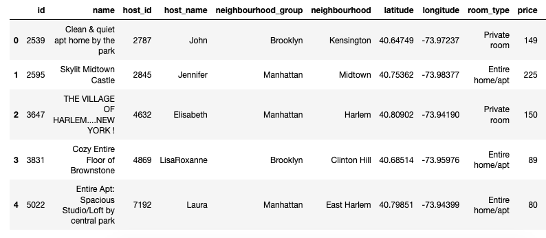
Let’s see the head of our DataFrame:
nyc.head()
Here’s how our DataFrame looks like:

Map! Map! Map!
In order to create our map, we’ll need two things:
1. The data that we are going to plot into our map.
2. The layout parameters to customize our map.
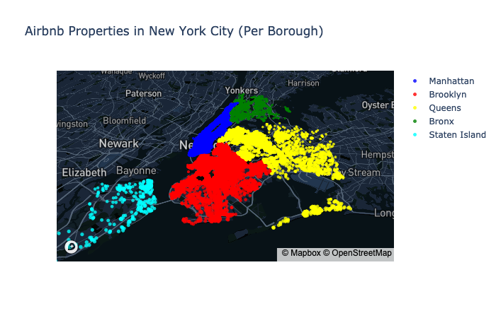
For this exercise, we want to see the Airbnb listings by borough; therefore, we’ll add the following code:
manhattan = nyc[nyc['neighbourhood_group'] == 'Manhattan']
brooklyn = nyc[nyc['neighbourhood_group'] == 'Brooklyn']
queens = nyc[nyc['neighbourhood_group'] == 'Queens']
bronx = nyc[nyc['neighbourhood_group'] == 'Bronx']
staten = nyc[nyc['neighbourhood_group'] == 'Staten Island']
We’ll use the latitude and longitude data points to map out the Airbnb listings.
data = [go.Scattermapbox(
            lat=manhattan['latitude'],
            lon=manhattan['longitude'],
            mode='markers',
            marker=dict(
                size= 5,
                color = 'blue',
                opacity = .8),
            name ='Manhattan'
          ),
        go.Scattermapbox(
            lat=brooklyn['latitude'],
            lon=brooklyn['longitude'],
            mode='markers',
            marker=dict(
                size= 5,
                color = 'red',
                opacity = .8),
            name ='Brooklyn'
          ),
       go.Scattermapbox(
            lat=queens['latitude'],
            lon=queens['longitude'],
            mode='markers',
            marker=dict(
                size= 5,
                color = 'yellow',
                opacity = .8),
            name ='Queens'
         ),
       go.Scattermapbox(
            lat=bronx['latitude'],
            lon=bronx['longitude'],
            mode='markers',
            marker=dict(
                size= 5,
                color = 'green',
                opacity = .8),
            name ='Bronx'
         ),
       go.Scattermapbox(
            lat=staten['latitude'],
            lon=staten['longitude'],
            mode='markers',
            marker=dict(
                size= 5,
                color = 'cyan',
                opacity = .8),
            name ='Staten Island')]
Now let’s add the layout code to make our map look nice!
layout = go.Layout(autosize=True,
                   title="Airbnb Properties in New York City (Per Borough)",
                   mapbox=dict(accesstoken="YOUR_TOKEN",
                               bearing=0,
                               pitch=50,
                               zoom=9,
                               center=dict(
                                   lat=40.6782,
                                   lon=-73.9442),
                               style= "YOUR_STYLE_LINK"))
FYI: in order to get an access token, you’ll need to sign up for Mapbox. The platform enables you to customize your maps so feel free to create your own unique style!
Let’s Get Our Map!
Now let’s put everything together and run the following code!
fig = dict(data=data, layout=layout)
iplot(fig)
Voila! Here it is!

That’s it! That’s all you need to combine the power of data and maps!
That’s the beauty of Python, it provides a toolbox that sparks our creativity to turn data into actionable insights to make better and informed decisions.
As always, feel free to share your comments and questions.
Thanks!