If you are working with economic data, a time series chart can show you how variables perform over a period of time. It can also help you identify trends and with forecasting.
Today we’ll create a couple of time series charts using the foreign exchange rate data from the Federal Reserve Board’s Data Download Program and Plotly, one of Python’s powerful data visualization libraries.
Getting Started
Just like in previous tutorials, we begin by importing the Python libraries that we’ll be using:
import pandas as pd
import numpy as np

import chart_studio.plotly as py
import plotly.express as px
import plotly.graph_objects as go

from plotly import version
from plotly.offline import download_plotlyjs, init_notebook_mode, plot, iplot
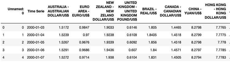
Let’s get our Foreign Exchange Rates DataFrame:
rates = pd.read_csv('Foreign_Exchange_Rates.csv')
rates.head()
Time Series Chart
Here’s our scenario: we would like to see how the exchange rate fluctuated for the following currencies: CAD/USD, CNY/USD, EUR/USD and GBP/USD.
Since our DataFrame contains daily rate information from January 3, 2000 to December 31, 2019, we’ll break it up in half.
From January 3, 2000 to December 31, 2010
fig = go.Figure()
fig.add_trace(go.Scatter(
                 x=rates['Time Serie'],
                 y=rates['CANADA - CANADIAN DOLLAR/US$'],
                 name="CAD/USD",
                 line_color='red'))

fig.add_trace(go.Scatter(
                 x=rates['Time Serie'],
                 y=rates['CHINA - YUAN/US$'],
                 name="CNY/USD",
                 line_color='blue'))

fig.add_trace(go.Scatter(
                 x=rates['Time Serie'],
                 y=rates['EURO AREA - EURO/US$'],
                 name="EUR/USD",
                 line_color='orange'))

fig.add_trace(go.Scatter(
                 x=rates['Time Serie'],
                 y=rates['UNITED KINGDOM - UNITED KINGDOM POUND/US$'],
                 name="GBP/USD",
                 line_color='green'))

fig.update_layout(xaxis_range=['2000-01-03','2010-12-31'],
                   title_text="Daily Exchange Rates (2000 - 2010)")

fig.show()
Here’s our result:
From January 1, 2011 to December 31, 2019
fig = go.Figure()
fig.add_trace(go.Scatter(
                 x=rates['Time Serie'],
                 y=rates['CANADA - CANADIAN DOLLAR/US$'],
                 name="CAD/USD",
                 line_color='red',
                 opacity=0.8))

fig.add_trace(go.Scatter(
                 x=rates['Time Serie'],
                 y=rates['CHINA - YUAN/US$'],
                 name="CNY/USD",
                 line_color='blue',
                 opacity=0.8))

fig.add_trace(go.Scatter(
                 x=rates['Time Serie'],
                 y=rates['EURO AREA - EURO/US$'],
                 name="EUR/USD",
                 line_color='orange',
                 opacity=0.8))

fig.add_trace(go.Scatter(
                 x=rates['Time Serie'],
                 y=rates['UNITED KINGDOM - UNITED KINGDOM POUND/US$'],
                 name="GBP/USD",
                 line_color='green',
                 opacity=0.8))

fig.update_layout(xaxis_range=['2011-01-01','2019-12-31'],
                   title_text="Daily Exchange Rates (2000 - 2019)",
                   xaxis_rangeslider_visible=True)

fig.show()
Check out our chart:
Did you notice anything different about the second chart? 🤔
In case you didn’t, there’s a slider at the bottom. You can use it to navigate the entire time series chart or to go in depth with a specific time range.
Isn’t that cool?
Let me know if you have any comments or questions!