Hello everyone!
There’s a way to visualize text data and that is through word clouds.
What is a Word Cloud?
First and foremost, a word cloud is another method of data visualization and it’s used for text analysis. Through font size and boldness, we are able to identify word frequencies from our text data.
How to Make a Word Cloud
Now that we have a clear definition, let’s create a few word clouds using the NYC Airbnb Open Data dataset.
Loading Our Libraries and DataFrame
Let’s start by importing the following libraries:
import pandas as pd
import numpy as np
import wordcloud

import seaborn as sns
import matplotlib.pyplot as plt
%matplotlib inline

from wordcloud import WordCloud, STOPWORDS, ImageColorGenerator
from PIL import Image
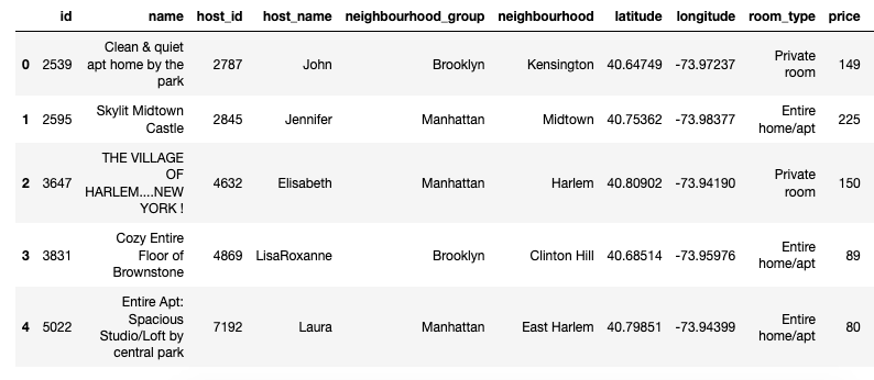
We will now load our DataFrame:
nyc = pd.read_csv('AB_NYC_2019.csv')
nyc.head()
Cleaning Up Our DataFrame
Let’s check if our DataFrame has any null values:
nyc.isnull().sum()
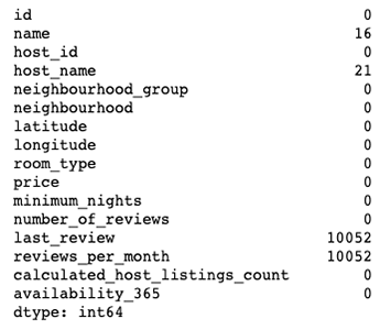
As you can tell, our DataFrame has null values in four data columns: name, host_name, last_review and reviews_per_month. Since we’ll be using the name data column in this tutorial, let’s clean it up.
Let’s get rid of the data columns that we don’t need:
nyc.drop(['id','last_review','reviews_per_month'],axis=1,inplace=True)
Let’s say goodbye to the null values:
nyc.dropna(inplace=True)
Now let’s see our DataFrame:
nyc.info()
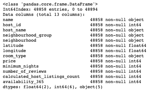
No more null values!
Getting Our Word Cloud
As I mentioned before, we’ll be using the name data column to conduct text analysis.
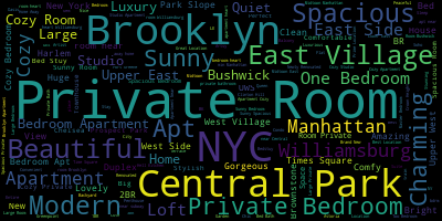
In order to generate our word cloud, we’ll join the Airbnb listing names together and use matplotlib to plot everything out:
plt.subplots(figsize=(10,10))
listing = WordCloud().generate(" ".join(name for name in nyc.name))
plt.imshow(listing, interpolation='bilinear')
plt.axis("off")
plt.show()
Removing Specific Words
We can use the STOPWORDS function to keep specific words away from our text analysis.
Let’s create a list that includes “NYC” and the name of the five boroughs:
stopwords = set(STOPWORDS)
stopwords.update(["Manhattan", "Brooklyn", "Queens", "Bronx", "Staten Island", "NYC"])
Let’s take a look at our new word cloud:
plt.subplots(figsize=(10,10))
listing = WordCloud(stopwords=stopwords, background_color='white').generate(" ".join(name for name in nyc.name))
plt.imshow(listing, interpolation='bilinear')
plt.axis("off")
plt.show()
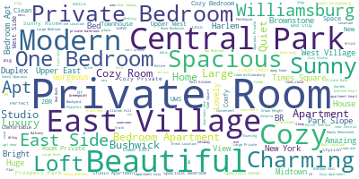
Using a Custom Image
Let’s take this to another level! How about if we use the MTA logo as our custom image to create a word cloud?
Here’s the image the we’ll be using:

This is the reason why we imported the Image function!
Let’s first open our image:
subway_logo = np.array(Image.open("mta.jpg"))
Since we want to use the MTA’s logo color scheme, we’ll use the ImageColorGenerator function to make it happen:
img = ImageColorGenerator(subway_logo)
Now let’s create our word cloud:
plt.subplots(figsize=(10,10))
listing = WordCloud(background_color='white',stopwords=stopwords, mask=subway_logo).generate(" ".join(name for name in nyc.name))
plt.imshow(listing.recolor(color_func=img), interpolation='bilinear')
plt.axis("off")
plt.show()
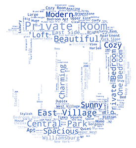
Our word cloud looks nice, huh?!
So which word cloud do you prefer? The traditional one or with a custom image?
As always, please let me know if you have any comments or questions. Thank you!