Hey everyone!
In my previous post, we created a heat map using a piece of the Bike Share Toronto Ridership dataset.
What do I mean by using a piece? Well, the actual dataset is split up quarterly and we only used the ridership data from Q1 2018.
How Did 2018 Pan Out? 🤔
As I mentioned at the end of the post, I was curious to see how the data would evolve throughout the year.
I concatenated the rest of the data and carried out some exploratory data analysis to see how the service was used.
Exploratory Data Analysis: DataFrame
Let me start by showing you the head of the DataFrame:

Just like in the heat map tutorial, I converted the trip_start_time and trip_stop_time into DateTime objects. I also extracted the hour, month and day of the week from these objects.
Here’s how it looks like:

Exploratory Data Analysis: Data Visualization
In order to make better sense of our data, I used several libraries (Seaborn, Matplotlib, Plotly and Mapbox) to create charts and maps.
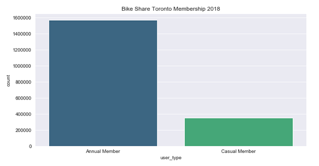
Type of Membership
82% of users are annual members. The remaining 18% purchase day passes or single trips.
Ridership Per Month
In this chart, we’ll see the amount of rides taken per month in Toronto:
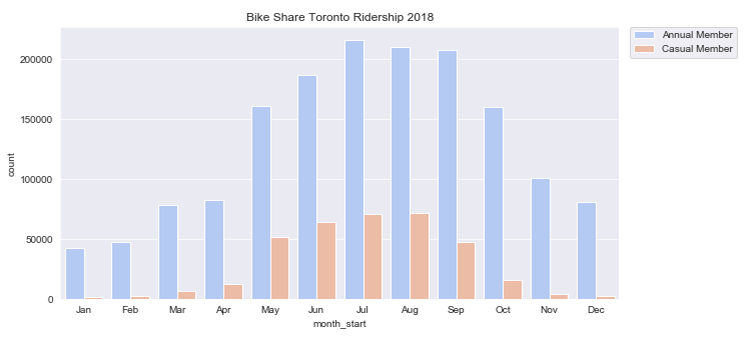
As you can see, ridership significantly increased during the warmer months of the year. Annual members peaked in July and casual members in August.
Ridership Per Day
Let’s take a look at the amount of rides taken per day:
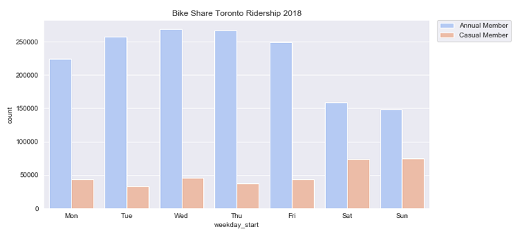
Annual members use Bike Share Toronto mostly during the week; especially from Tuesday to Thursday. While casual members use it mostly on the weekends.
Ridership Per Hour
Now let’s take a look at the activity per hour:
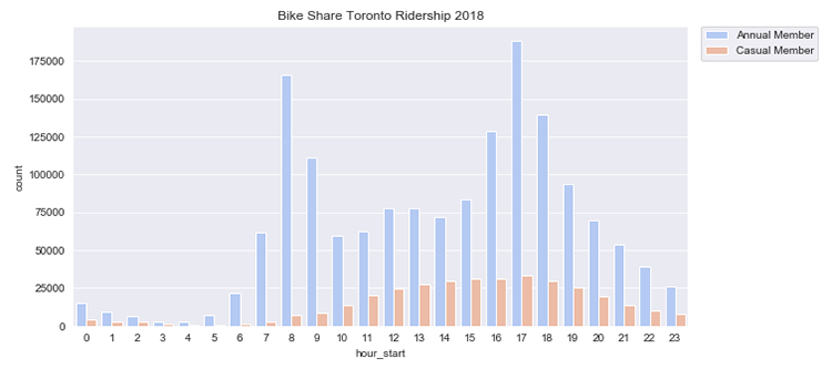
Annual members mostly ride between 8am-9am and 4pm-6pm; whereas, casual members use it consistently from noon to the early evening hours.
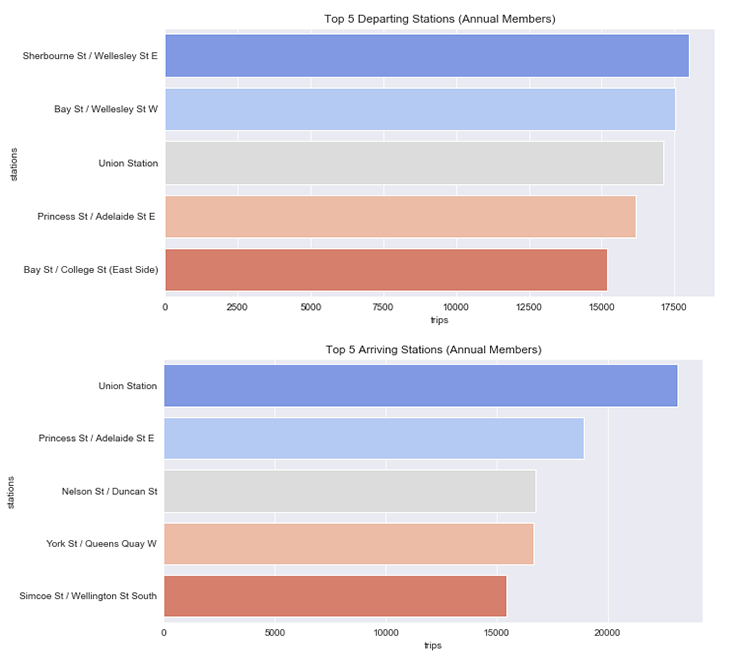
Bike Stations
These are the most frequently used bike stations among annual members:
These are the most frequently used bike stations among casual members:
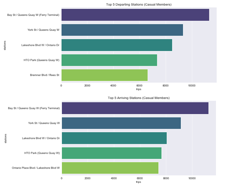
Casual members stayed close to the Central Waterfront, Entertainment District and vicinity.
Longest Trips
Let’s map out the longest bike trips in 2018:
What Can We Tell From This EDA?
1. The ridership increased as the weather got warmer.
2. Most users are annual members.
3. If we look at the daily and hourly riding activity of annual members, it’s possible that they use Bike Share Toronto as a way to commute to work or to school.
4. If we look at the station and riding activity of casual members, it’s more than likely that they are enjoying a vacation in beautiful Toronto.
What else can you tell from this brief exploratory data analysis? Feel free to comment!