Hey there!
Aside from survey design, I also take care of data analysis. This week I want to show you something important that I do with large datasets and that is exploratory data analysis.
Very important: the New York City Airbnb Open Data dataset that I’ll be using is public and can be found in Kaggle.
Moving forward, I’ll be doing basic exploratory data analysis using Python. The first step is importing these two Python libraries for data analysis:
import pandas as pdimport numpy as np
Also, these Python libraries for data visualization:
import seaborn as snsimport matplotlib.pyplot as plt%matplotlib inline
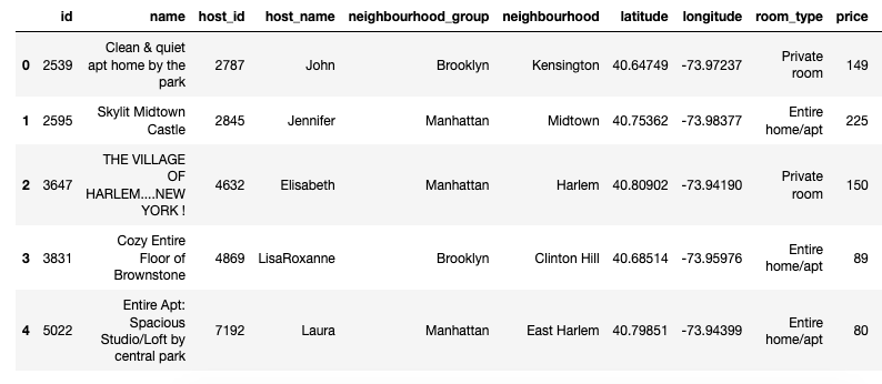
Since I am working with a .csv file, Pandas makes it easy to convert it into a DataFrame which I’ll name it nyc:nyc = pd.read_csv('AB_NYC_2019.csv')
Now let’s get the head of the DataFrame that I just created:nyc.head()
Voila!
It’s time to do some basic exploratory data analysis!
For example, I want to know what the average price per night is in NYC:nyc['price'].mean()
Answer: 152.7206871868289
Then I want to know how many AirBnB listings are in each NYC borough:nyc['neighbourhood_group'].value_counts()
This is how it pans out:Manhattan 21661Brooklyn 20104Queens 5666Bronx 1091Staten Island 373
For a visual representation, here’s a nice countplot using Seaborn:sns.countplot(y='neighbourhood_group', data=nyc, palette='coolwarm', order=nyc['neighbourhood_group'].value_counts().index)

Let’s dive a bit deeper: what’s the average price per night in each NYC borough?nyc[nyc['neighbourhood_group']=='Manhattan']['price'].mean() …and so forth for each borough.
Answer: 196.8758136743456
Here’s a small DataFrame to show you how this looks:borough_data = pd.DataFrame({'Avg. Price': [196.8758136743456, 124.38320732192598, 114.81233243967829, 99.51764913519237, 87.4967919340055]},
index=['Manhattan', 'Brooklyn', 'Staten Island', 'Queens', 'Bronx'])borough_data.index.names = ['Borough']borough_data

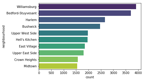
Ok, but which NYC neighborhoods have the most listings?nyc['neighbourhood'].value_counts().head(10)
This is how it pans out:Williamsburg 3920Bedford-Stuyvesant 3714Harlem 2658Bushwick 2465Upper West Side 1971Hell's Kitchen 1958East Village 1853Upper East Side 1798Crown Heights 1564Midtown 1545
For a visual representation, here’s another nice countplot:sns.countplot(y='neighbourhood', data=nyc, palette='viridis', order=nyc['neighbourhood'].value_counts().index[:10])
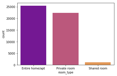
Now, what are the type of listings in NYC?nyc['room_type'].value_counts()
This is how it pans out:Entire home/apt 25409Private room 22326Shared room 1160
I love graphs so here’s another one!sns.countplot(x='room_type', data=nyc, palette='plasma', order=nyc['room_type'].value_counts().index)
As you can see, I kept this EDA short and sweet. There’s a major reason why I do exploratory data analysis: it gives me a better outlook on the data which enables me to discover new insights.
Now I can dig deeper to find out answers to questions like:
- What’s the most popular NYC neighborhood for people who book on AirBnB?
- What’s the average price per night for an apartment in Chelsea? And how does it compare to the same type of listing in Greenwich Village?
- Is there any correlation between price and reviews? Or between the type of listing and availability?
- Can I predict prices to set a better rate for an AirBnB listing in Park Slope?
The sky’s the limit!